Code
library(tidyverse)
library(targets)
library(GGally)
library(kableExtra)
tar_source()library(tidyverse)
library(targets)
library(GGally)
library(kableExtra)
tar_source()In the initial modeling notebook, I discovered some problems with parameter identifiability. Here I will explore this issue further.
Initially I ran the model described in the May 13, 2024 draft with 100 different starting parameters. Here are 5 sets of very different best-fitting parameters that produce nearly identical fits as measured by the negative log-likelihood (deviance):
fits <- readRDS("output/five_parsets_exp2.rds")
fits$set <- paste0("set", 1:5)

fits[, 1:6] |>
  as.data.frame() |>
  `rownames<-`(fits$set) |>
  kbl() %>%
kable_styling()| prop | prop_ltm | rate | tau | gain | deviance | |
|---|---|---|---|---|---|---|
| set1 | 0.098 | 0.815 | 0.006 | 0.084 | 96.954 | 40.377 |
| set2 | 0.132 | 0.818 | 0.009 | 0.108 | 54.078 | 40.429 |
| set3 | 0.155 | 0.820 | 0.010 | 0.123 | 40.135 | 40.491 |
| set4 | 0.173 | 0.822 | 0.011 | 0.133 | 32.738 | 40.556 |
| set5 | 0.215 | 0.826 | 0.013 | 0.154 | 21.967 | 40.772 |
We can see that they all produce nearly identical predictions (the lines are the model predictions, the points are the data):
fits |>
  mutate(pred = map2(fit, data, \(x, y) predict(x, y, group_by = c("chunk", "gap")))) |>
  unnest(c(data, pred)) |>
  mutate(gap = as.factor(gap)) |>
  ggplot(aes(x = gap, y = p_correct, color = chunk)) +
  geom_point() +
  geom_line(aes(y = pred, linetype = set, group = interaction(chunk, set))) +
  scale_color_discrete("First chunk LTM?") +
  scale_linetype_discrete("Parameter set") +
  facet_grid(~itemtype) +
  theme_pub()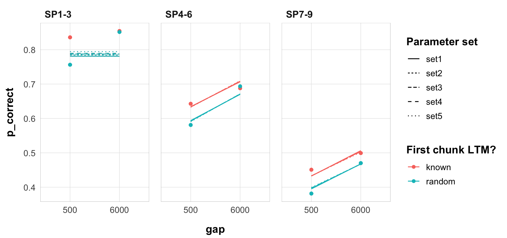
The plot below shows the strong nearly linear trade-offs between the parameters.
fits |>
  select(prop, rate, tau, gain) |>
  ggpairs(
    diag = list(continuous = "blankDiag"),
    upper = list(continuous = "points")
  ) +
  theme_pub() +
  theme(axis.text.x = element_text(angle = 45, hjust = 1))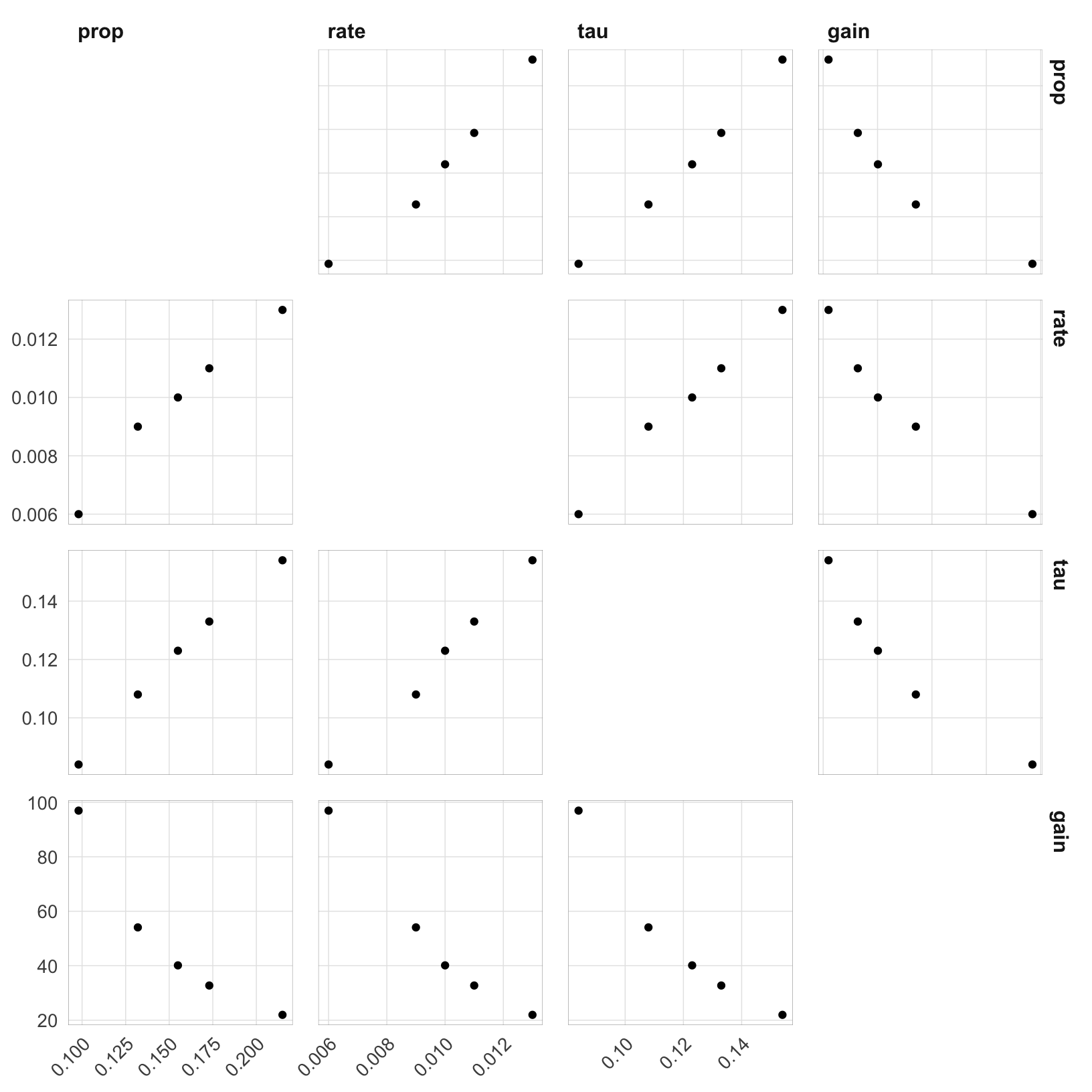
I ran a simulation in which I fix1 the rate parameter to values in the range 0.005 to 0.2. I want to see if the identical fits extend to higher rates.
We first extract the best-fitting parameters for each rate from the 100 random start fits.
tar_load(fits2)
fits2 <- fits2 |>
  mutate(
    deviance = pmap_dbl(list(fit, data, exclude_sp1), function(x, y, z) {
      overall_deviance(x$par, data = y, exclude_sp1 = z)
    }),
    rate = round(rate, 3)
  )


best <- fits2 |>
  group_by(rate, exp, exclude_sp1) |>
  filter(deviance == min(deviance)) |>
  slice(1) |>
  select(rate, prop, prop_ltm, tau, gain, deviance, fit, data) |>
  mutate(pred = map2(fit, data, \(x, y) predict(x, y, group_by = c("chunk", "gap")))) |>
  ungroup()
Adding missing grouping variables: `exp`, `exclude_sp1`subset for exp2 and exclude_sp1 = TRUE
best_subset <- filter(best, exp == 2, exclude_sp1)From the deviance it’s already clear that the fits get wose once we get above 0.020 rate. Here are the best-fitting parameters for each rate:
best_subset |>
  select(rate, prop, prop_ltm, tau, gain, deviance) |>
  mutate_all(round, 3) |>
  kbl() %>%
kable_styling()| rate | prop | prop_ltm | tau | gain | deviance |
|---|---|---|---|---|---|
| 0.005 | 0.098 | 0.812 | 0.084 | 100.000 | 42.689 |
| 0.010 | 0.155 | 0.819 | 0.121 | 41.585 | 40.518 |
| 0.015 | 0.235 | 0.826 | 0.159 | 19.374 | 40.871 |
| 0.020 | 0.316 | 0.835 | 0.183 | 11.537 | 41.687 |
| 0.025 | 0.389 | 0.841 | 0.194 | 8.143 | 43.185 |
| 0.030 | 0.451 | 0.844 | 0.197 | 6.359 | 45.610 |
| 0.035 | 0.496 | 0.842 | 0.197 | 5.394 | 49.069 |
| 0.040 | 0.528 | 0.834 | 0.196 | 4.765 | 53.434 |
| 0.045 | 0.324 | 0.465 | 0.210 | 8.718 | 57.907 |
| 0.050 | 0.355 | 0.459 | 0.220 | 7.359 | 58.648 |
| 0.055 | 0.384 | 0.455 | 0.228 | 6.362 | 59.535 |
| 0.060 | 0.412 | 0.448 | 0.234 | 5.559 | 60.563 |
| 0.065 | 0.439 | 0.442 | 0.239 | 4.955 | 61.729 |
| 0.070 | 0.466 | 0.438 | 0.244 | 4.430 | 63.027 |
| 0.075 | 0.271 | 0.452 | 0.198 | 12.494 | 63.309 |
| 0.080 | 0.272 | 0.457 | 0.199 | 12.582 | 63.309 |
| 0.085 | 0.271 | 0.464 | 0.200 | 12.799 | 63.309 |
| 0.090 | 0.271 | 0.470 | 0.200 | 12.950 | 63.309 |
| 0.095 | 0.271 | 0.476 | 0.201 | 13.072 | 63.309 |
| 0.100 | 0.271 | 0.481 | 0.202 | 13.233 | 63.309 |
A few observations:
Here’s a pairs plot with colors indicating the rate group. The plot indicates that the parameter space does not have a smooth gradient, but rather jumps between regions when rate is fixed to different values.
best_subset <- best_subset |>
  mutate(par_groups = case_when(
    rate <= 0.02 ~ "0.005-0.02",
    rate <= 0.04 ~ "0.025-0.04",
    rate <= 0.07 ~ "0.045-0.07",
    TRUE ~ "0.07-0.2"
  ))

best_subset |>
  select(prop, prop_ltm, rate, tau, gain, par_groups) |>
  ggpairs(
    aes(color = par_groups),
    diag = list(continuous = "blankDiag"),
    upper = list(continuous = "points")
  ) +
  theme_pub() +
  theme(axis.text.x = element_text(angle = 45, hjust = 1))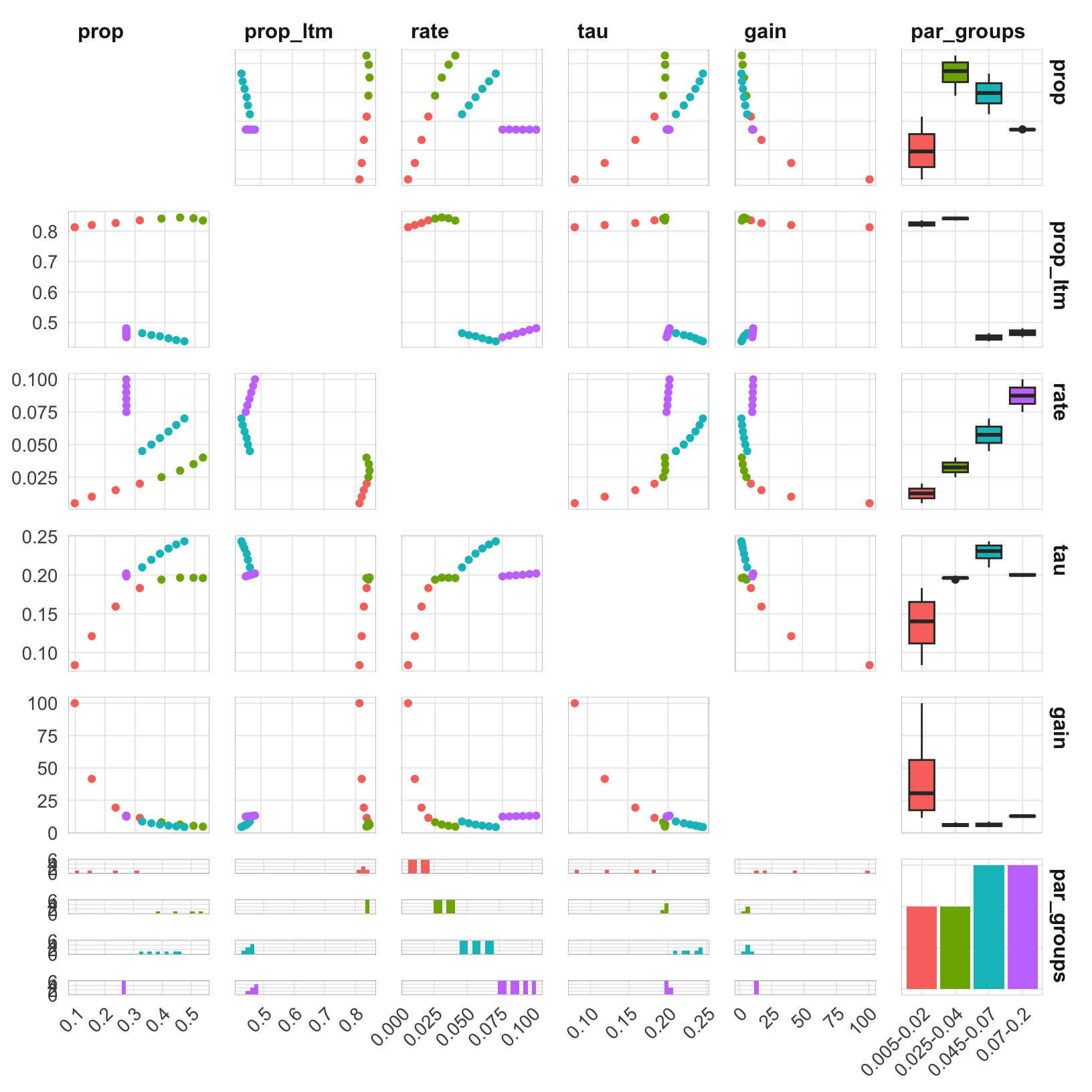
Let’s see how this affects the predictions for the different rate groups. It would be too much to plot all the predictions, so I will first plot the predictions for the first and last parameters for each rate group.
best_subset |>
  group_by(par_groups) |>
  slice(c(1, n())) |>
  unnest(c(data, pred)) |>
  mutate(
    gap = as.factor(gap),
    rate = as.factor(round(rate, 3))
  ) |>
  ggplot(aes(x = gap, y = p_correct, color = chunk)) +
  geom_point() +
  geom_line(aes(y = pred, linetype = par_groups, group = interaction(chunk, rate))) +
  scale_color_discrete("First chunk LTM?") +
  scale_linetype_discrete("Rate") +
  facet_grid(rate ~ itemtype) +
  theme_pub()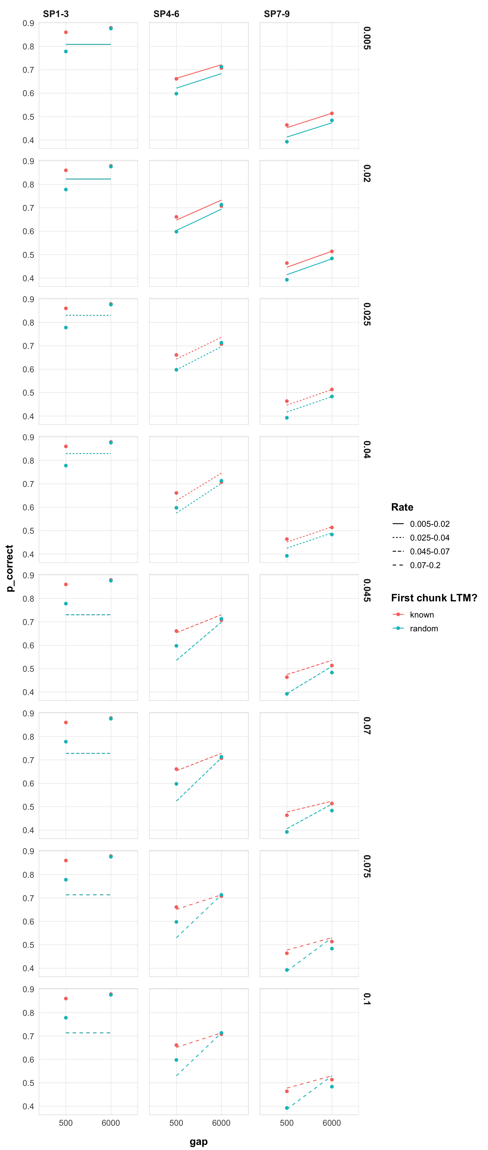
A few observations:
I will now include SP1-3 in the fits and see if this changes the parameter space.
best_subset <- filter(best, exp == 2, exclude_sp1 == FALSE)Here are the best-fitting parameters for each rate:
best_subset |>
  select(rate, prop, prop_ltm, tau, gain, deviance) |>
  mutate_all(round, 3) |>
  kbl() %>%
kable_styling()| rate | prop | prop_ltm | tau | gain | deviance |
|---|---|---|---|---|---|
| 0.005 | 0.109 | 0.875 | 0.091 | 92.939 | 119.499 |
| 0.010 | 0.216 | 0.869 | 0.149 | 24.963 | 114.013 |
| 0.015 | 0.303 | 0.867 | 0.176 | 13.406 | 110.780 |
| 0.020 | 0.374 | 0.863 | 0.189 | 9.213 | 109.681 |
| 0.025 | 0.432 | 0.860 | 0.193 | 7.153 | 110.370 |
| 0.030 | 0.481 | 0.859 | 0.193 | 5.961 | 112.559 |
| 0.035 | 0.527 | 0.857 | 0.191 | 5.106 | 116.055 |
| 0.040 | 0.567 | 0.853 | 0.187 | 4.514 | 120.700 |
| 0.045 | 0.602 | 0.853 | 0.183 | 4.074 | 126.391 |
| 0.050 | 0.640 | 0.852 | 0.177 | 3.679 | 133.024 |
| 0.055 | 0.667 | 0.853 | 0.172 | 3.429 | 140.578 |
| 0.060 | 0.697 | 0.852 | 0.166 | 3.181 | 148.930 |
| 0.065 | 0.723 | 0.852 | 0.161 | 2.992 | 158.062 |
| 0.070 | 0.749 | 0.851 | 0.155 | 2.811 | 167.905 |
| 0.075 | 0.773 | 0.853 | 0.148 | 2.660 | 178.428 |
| 0.080 | 0.793 | 0.854 | 0.143 | 2.537 | 189.595 |
| 0.085 | 0.816 | 0.852 | 0.136 | 2.405 | 201.389 |
| 0.090 | 0.836 | 0.854 | 0.130 | 2.300 | 213.730 |
| 0.095 | 0.855 | 0.855 | 0.124 | 2.203 | 226.585 |
| 0.100 | 0.873 | 0.855 | 0.118 | 2.115 | 239.930 |
This now looks much more stable. Until 0.130 we don’t have switchest in the parameter region. Still, rates 0.005-0.03 are very similar.
Here are the plots for rates 0.005-0.10:
pred_data <- best_subset |>
  unnest(c(data, pred)) |>
  mutate(
    gap = as.factor(gap),
    rate = round(rate, 3)
  )

myplot <- function(data) {
  ggplot(data, aes(x = gap, y = p_correct, color = chunk)) +
    geom_point() +
    geom_line(aes(y = pred, group = chunk)) +
    scale_color_discrete("First chunk LTM?") +
    facet_grid(rate ~ itemtype) +
    theme_pub()
}myplot(filter(pred_data, rate < 0.026))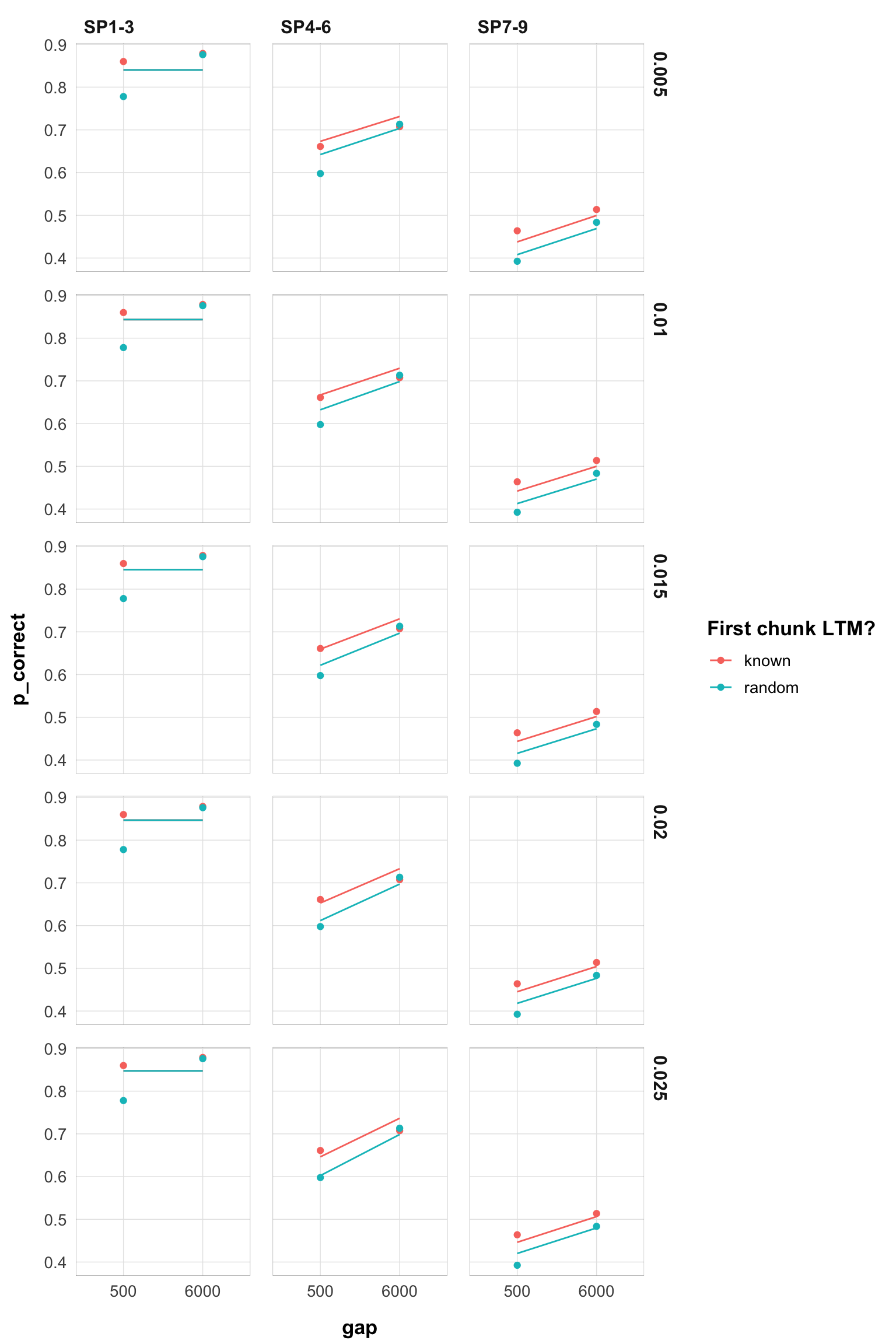
myplot(filter(pred_data, rate < 0.051 & rate > 0.029))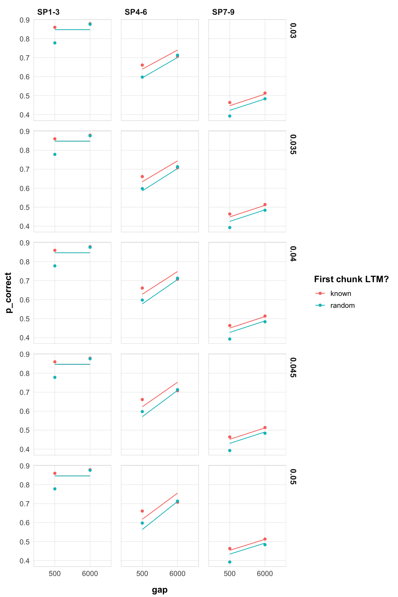
myplot(filter(pred_data, rate < 0.076 & rate > 0.054))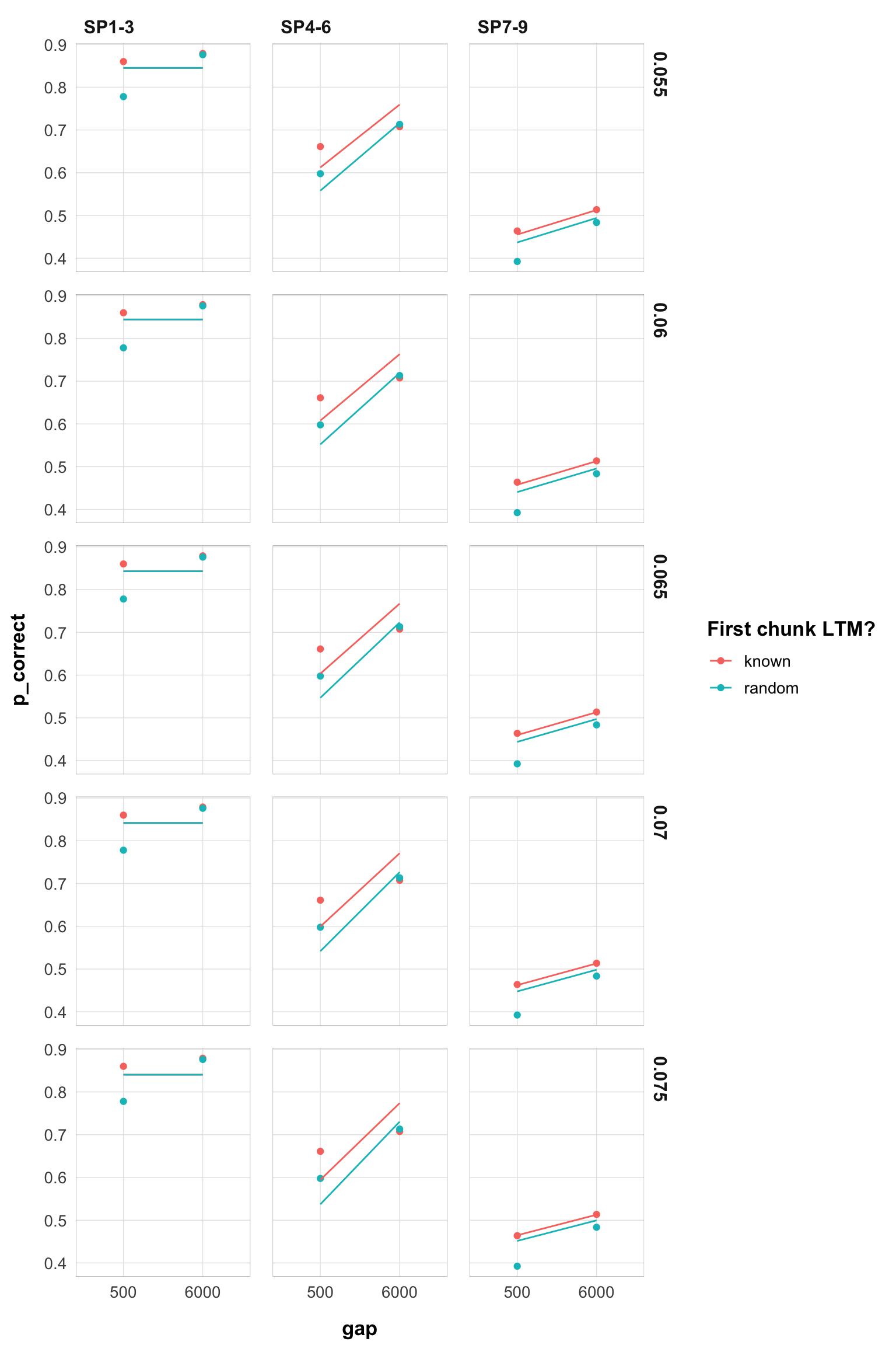
myplot(filter(pred_data, rate > 0.079, rate < 0.101))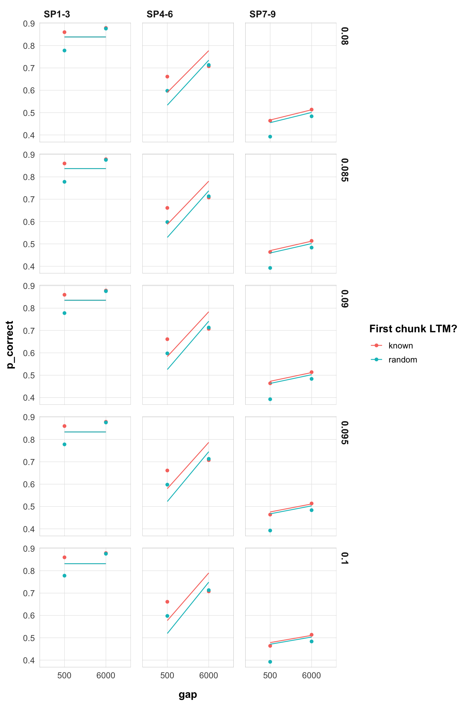
I will now repeat the same analysis for experiment 1.
best_subset <- filter(best, exp == 1, exclude_sp1)

best_subset |>
  select(rate, prop, prop_ltm, tau, gain, deviance) |>
  mutate_all(round, 3) |>
  kbl() %>%
kable_styling()| rate | prop | prop_ltm | tau | gain | deviance |
|---|---|---|---|---|---|
| 0.005 | 0.106 | 0.573 | 0.089 | 100.000 | 36.273 |
| 0.010 | 0.115 | 0.576 | 0.096 | 85.610 | 31.959 |
| 0.015 | 0.170 | 0.579 | 0.129 | 40.879 | 32.380 |
| 0.020 | 0.223 | 0.587 | 0.154 | 24.841 | 33.079 |
| 0.025 | 0.270 | 0.593 | 0.172 | 17.465 | 34.078 |
| 0.030 | 0.314 | 0.600 | 0.184 | 13.397 | 35.384 |
| 0.035 | 0.351 | 0.602 | 0.192 | 11.022 | 37.002 |
| 0.040 | 0.384 | 0.605 | 0.197 | 9.416 | 38.918 |
| 0.045 | 0.413 | 0.607 | 0.200 | 8.305 | 41.117 |
| 0.050 | 0.439 | 0.608 | 0.202 | 7.448 | 43.575 |
| 0.055 | 0.457 | 0.603 | 0.204 | 6.888 | 46.274 |
| 0.060 | 0.481 | 0.603 | 0.205 | 6.310 | 49.177 |
| 0.065 | 0.497 | 0.598 | 0.206 | 5.889 | 52.249 |
| 0.070 | 0.510 | 0.594 | 0.207 | 5.570 | 55.470 |
| 0.075 | 0.405 | 0.374 | 0.221 | 7.375 | 56.971 |
| 0.080 | 0.423 | 0.369 | 0.225 | 6.802 | 58.529 |
| 0.085 | 0.441 | 0.367 | 0.228 | 6.311 | 60.169 |
| 0.090 | 0.457 | 0.364 | 0.230 | 5.910 | 61.889 |
| 0.095 | 0.474 | 0.360 | 0.232 | 5.534 | 63.682 |
| 0.100 | 0.490 | 0.357 | 0.234 | 5.222 | 65.541 |
similar switch at 0.075 to a different region of the parameter space.
Here are the plots for rates 0.005-0.10:
pred_data <- best_subset |>
  unnest(c(data, pred)) |>
  mutate(
    gap = as.factor(gap),
    rate = round(rate, 3)
)myplot(filter(pred_data, rate < 0.026))-1.png)
myplot(filter(pred_data, rate < 0.051 & rate > 0.029))-1.png)
myplot(filter(pred_data, rate < 0.076 & rate > 0.054))-1.png)
myplot(filter(pred_data, rate > 0.079, rate < 0.101))-1.png)
so even a rate of 0.07 does not necessarily predict a big interaction
technically, I put a really narrow prior Normal(value, 0.0001) on the rate parameter rather than fixing it just because I can do it in the existing code.↩︎